Design Guidelines
At Atoa, our goal is to streamline the payment process to make it as smooth as possible. This guide outlines key design elements you can incorporate for better integration with Atoa’s payment system.
Feel free to use the Figma file to customize and make any necessary adjustments.
Displaying Atoa QR Codes
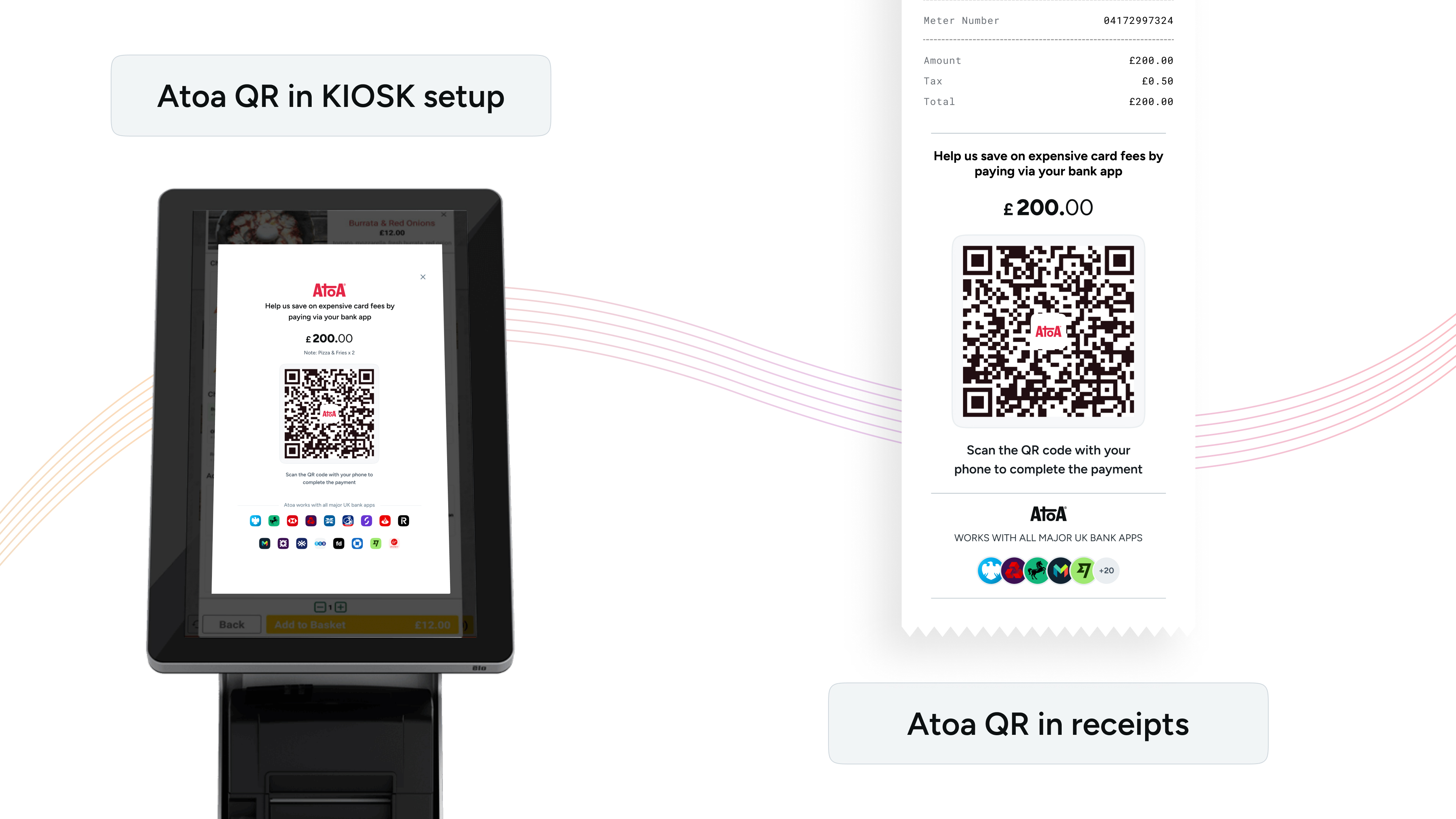
For POS systems and till screens, our Payment-Process API offers a unique feature. By specifying EXTERNAL_DISPLAY and RECEIPT in the template parameter, you will receive links to two distinct images. These images are designed for integration into your system:

Till Screen: Display Atoa’s QR code directly on your kiosk or till screen to let customers scan and pay easily. This is ideal for self-serve restaurants with kiosk setups, or if your till features a customer-facing display.
Invoice Receipts: Add Atoa’s dynamic QR code to invoice receipts for a smooth payment process. This method is particularly effective in restaurants, giving customers more time to pay without waiting for staff.
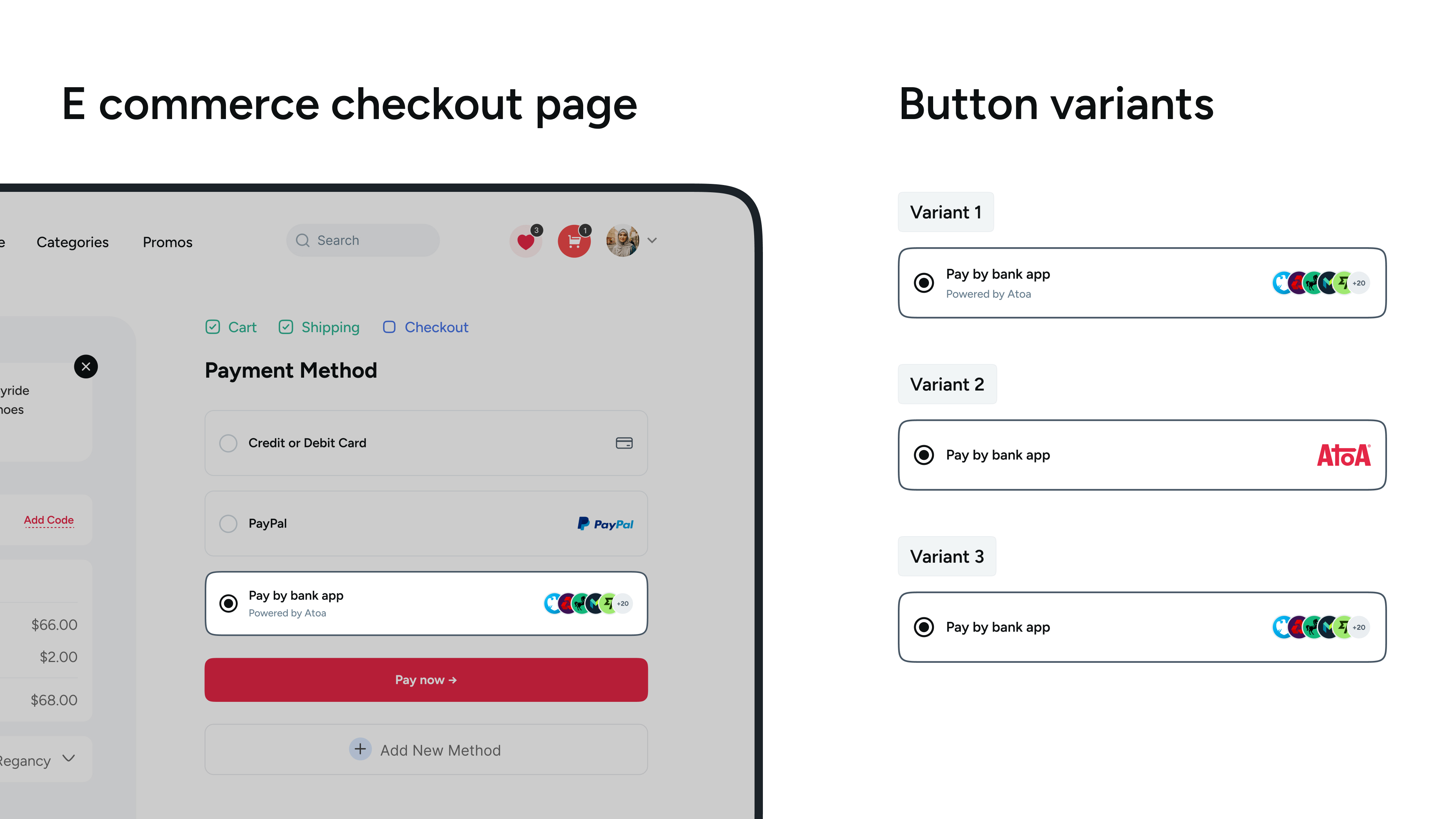
Buttons in the Payment flow
To add Atoa as a payment option to your system, we provide a set of assets designed for seamless integration and to align with Atoa’s branding and user interface guidelines. You’ll find these ready-to-use assets below, ready for implementation into your payment gateway or web integrations.
